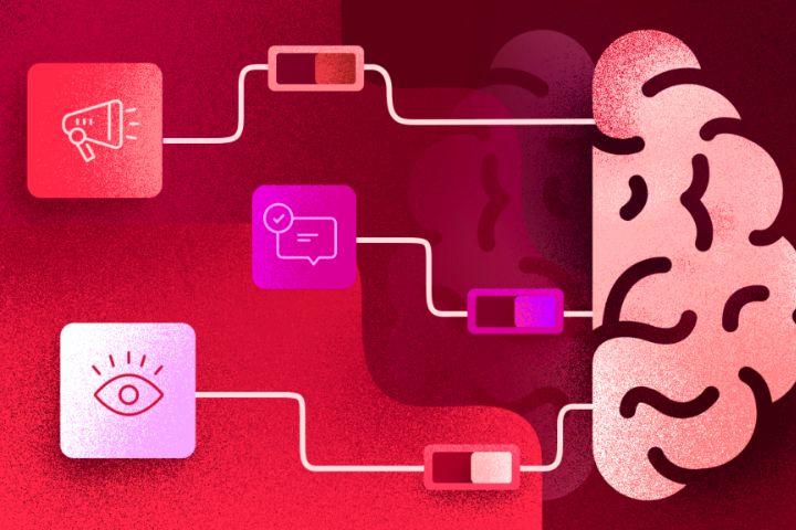
Neuromarketing is the marketing technique of combining cognitive neuroscience and communication techniques to understand consumer behaviors. This is achieved through links between brain and cognitive activities.
The reactions of the brain and nervous system are observed and measured during exposure to advertising messages. Emotional reactions make it possible to highlight the influence of certain parameters on the feeling of advertising. Facial reactions and the context of viewing can, for example, have an impact on brain processing and therefore overall perception.
The objective is to understand purchasing behavior in the face of different advertising stimuli. The analysis of these behaviors allows a marketing department to improve the design of a product or service as well as to refine its promotion.
Neuromarketing was born in the United States in the 2000s. It is a very recent discipline, highlighted by the experiences of Coca Cola and Pepsi in particular. Brands‘ interest in improving their marketing campaigns has only increased since then.
Table of Contents
Concrete Examples Of Using Neuromarketing In Advertising To Boost Sales
Neuromarketing is therefore a particularly interesting practice in order to know the public’s feeling about a product or service. In case of poor results, an adaptation can be made. Here’s how neuromarketing is used in advertising to boost sales.
The role of colors and their impact on the consumer
The choice of colors for a product is an essential phase. Indeed, a yellow color will not have the same effect on the consumer as a black color for a certain type of product.
In humans, colors are associated with emotions. The sight of blue is generally pleasant because it is associated with things that we appreciate. Here we can evoke the sea, the lake, or the sky for example. As with psychology in email marketing, choosing the right color allows you to create a different image for your target audience: red evokes warmth while orange attracts more confidence.
Associating a color in relation to the emotion released by the product makes it much more visually attractive. Coca-Cola is a good example of the use of color in neuromarketing. Red catches the eye and catches the eye in order to encourage consumption. This is not the only explanation for the success of his communication but it contributes to it.
Pricing: determining the price that will trigger the most sales
Determining a price is not an easy task. Between them, consumers may indeed have a very different perception of the same price. Similarly, the products themselves cause difficulty in establishing pricing.
The strategy of the lower penny price, such as €19.99, is strongly present today. Long touted as a purchase trigger, recent studies show that round prices are more likely to trigger the purchase. Do not hesitate to grope to find the price that will trigger the most sales.
For this, a quality commercial hook is sometimes what is needed. In terms of price, skillfully placing the discount that is offered (thanks to bright colors for example) makes it possible to highlight it and capture the consumer’s attention. Similarly, in case of advantages on a second purchase, make it appear correctly so that the consumer does not miss the information.
Precision is also required. The one who sees the price must not be lost. Be clear and precise so that the information is understood quickly.
The marketing hook: arouse the curiosity of the consumer from the 1st message
You should know that in psychology there is a halo effect: the first impressions you have on someone or a product often condition the rest of the relationship. There is a reason why it is said that it is important to make a good impression from the first meeting. This concept is very widespread in the world of flirting, where a boy must seduce the girl in the first minutes of a meeting.
In the field of marketing and product sales, this principle is also present. Are you really going to stay on a site whose design is not neat and visually unattractive? There is little chance.
However, this reasoning has a flaw. The value of a thing is often evaluated in comparison to others and not for its true value. This is the reason why the marketing hook is important. If you manage to arouse the curiosity and interest of a consumer in the first message, he will surely stay on your product/service. It’s up to you to convince him to go on to buy.
UX and UI design of a website: boost engagement and web sales
In terms of website design, neuromarketing makes it possible to highlight the elements that will boost engagement on your platform.
Several parameters will positively influence the feeling of a visitor to a site. All this appeals to UX (User Experience) and UI (User Interface) design. The construction of an e-commerce store must therefore take into account what pleases Internet users, from a neurological point of view.
Colors should not be too aggressive and rather in relation to each other to avoid the impression of coloring. Similarly, the size and arrangement of elements has an impact on the perception of people on your site. For example, information emitted horizontally will be less read than vertically arranged information because the brain has a natural tendency to collect it from top to bottom.
These small design details, which can be innocuous at first glance, will boost the engagement of your visitors. By increasing it, you will have more chances to sell.
