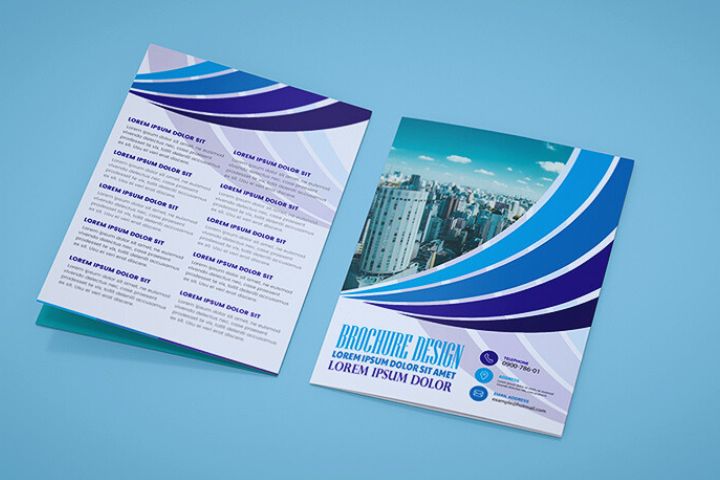
A flyer or advertising brochure is one of the most used advertising graphic elements.
The content of a flyer is intended to communicate a message or sell products, services and even events.
Flyers can be delivered by hand to the business itself, on the street or even distributed on a large scale through the mailbox. With the arrival of the Internet, the use of printed flyers has been distributed with the use of digital flyers, but in both a good design and organization of content is the most important thing to make it unforgettable and fulfill its purpose.
The main objective of a flyer is to capture the attention of the person who is viewing it to transmit its content: publicize a business, sell a product, invite to a concert… For this reason, the design of the flyer is very important, here we give you some tips so you can achieve better results on your advertising investments.
Table of Contents
Less Is More
Keep your content short and concise taking into account the size of your flyer. Try to concentrate your content on clear and short ideas so that it does not look cluttered and is readable.
Divide And Conquer
Instead of making one long column of text, break it up into parts to make it look more interesting. Long paragraphs with a lot of text can make you lose the reader’s attention by looking boring. Use spaces that allow the different texts to breathe and create harmony. If you have a lot of information you can use bullet points to separate ideas into short lines.
Get Their Attention
For each paragraph create an interesting and eye-catching title. The titles are the first thing we read, try to make them attractive and interesting so that they continue reading. Use original formats such as elongated flyers.
An Action
It is a short message that tells the reader that he should do something, such as: “Call us”, “Buy now”…
Speak Their Language
Take into account the audience to which the information is directed and write the content using their way of speaking. This will help them understand you better and identify with your brand.
Color Does Matter
Use colors that help make your message stand out. The psychology of color helps convey a feeling that should accompany the message of your flyer. Also use your corporate colors so that the reader can identify you and remember you.
The Source
A good choice of typography is very important. It is important not to choose more than 3 types of letters; You can use an eye-catching one for the titles, a readable one for the text and another to highlight a point or message.
Make It Clear Where To Fid You
Never forget to leave all the contact details to make it easier for the reader to get in touch. This includes telephone, address, website, social networks, etc.
A Picture Is Worth More Than A Thousand Words
As long as the image is of good quality and looks good. Do not use images that are not of good quality or distorted, this instead of enriching the brochure will give a bad image.
Corporate
Both in your brochures and in your other advertising elements, use your name or logo. This will give more power to your brand and make it more recognizable.
Quality
The quality of the printing will make your flyers look more professional. Use good quality papers and the highest weight possible so that they have a better appearance. You can also use laminates if the objective of your brochure is to have greater durability.
Distances
Leaving spaces between text and other elements will help make it look cleaner and be easier to read. You also cannot forget the safety margin and bleed, the cuts are not always exact and there is a margin of error, so it is important not to put important elements or texts near the edges of the brochure.
Also read : Retargeting
